
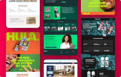



A website can look perfectly respectable and still cost a business work. If visitors cannot quickly tell what you do, why they should trust you, or what to do next, they leave. That is why web design Kent businesses need is not about adding a few fashionable effects to a template. It is about making the right first impression, then backing it up with a clear route to an enquiry, call or sale.
For a local service business, that could mean putting proof, services and contact options exactly where a nervous buyer expects to find them. For an ecommerce brand, it means product pages that answer questions, build confidence and do not turn checkout into hard work. Different businesses need different things. The commercial job of the website stays the same: help the right people choose you.
A Kent website has to do more than look tidy
Kent is packed with capable businesses competing for attention. From trades and construction firms to professional services, venues and independent retailers, plenty of companies offer a good service. The problem is that their website does not always show it.
A dated logo, awkward mobile layout or page full of vague claims can make a solid business feel smaller, less established or harder to trust than it really is. Visitors may not say that out loud. They simply move on to the next result in Google.
Good design changes that perception quickly. It gives your business a recognisable visual identity, a clear hierarchy of information and a tone that feels like the people behind it. It makes you look like you mean it – not like you bought a website because you felt you ought to.
But visual polish is only one part of the work. A beautiful homepage is not much use if the service pages are thin, the forms fail on mobile, the site takes too long to load or nobody can find you in search. Design, content, structure and technical delivery need to pull in the same direction.
What web design in Kent should deliver
The best web design in Kent begins before anyone chooses a typeface. It starts with a sensible conversation about the business: who you want to reach, what they need to know before getting in touch, which services or products matter most, and what makes you a better choice than the alternatives.
That does not require a 70-page strategy document. It does require decisions. Trying to appeal equally to everyone often produces a website that says very little to anyone.
Clear messages, not clever waffle
Visitors should understand the basics within seconds. What do you offer? Where do you work? Who is it for? Why are you credible? A homepage does not need to tell your entire story, but it should make the next click obvious.
Plain language usually wins. If you are a specialist, explain the benefit of your expertise rather than hiding behind industry terms. If you work locally, say so. If your customers value speed, quality, accreditations or a personal service, show evidence rather than relying on empty promises.
Case studies, testimonials, project photography and useful detail all matter here. They turn a claim such as ‘trusted and reliable’ into something people can actually believe.
Mobile-first journeys that respect people’s time
Most local searches begin on a phone, often between meetings, on a train or after a frustrating experience with another supplier. A mobile site needs to be easy to scan, tap and contact. Navigation should not be a puzzle, images should earn their place, and key actions should stay within reach.
This is not an argument for stripping every page back to nothing. Some businesses need detailed technical information, galleries, booking details or product options. The point is to organise that information well. Give people the essentials first, then let them go deeper when they are ready.
A site that produces useful enquiries
Conversion is not about pushing every visitor into a pop-up. It is about reducing doubt. A good enquiry journey answers the practical questions: what happens next, how quickly will someone respond, what areas do you cover, and what information should a customer provide?
The right call to action depends on the purchase. A high-value construction project may need a consultation request. A restaurant may need bookings. A retailer needs a straightforward route to the basket. One generic ‘Contact us’ button can work, but it should not be the only thought given to how people become customers.
Search foundations built into the build
Search engine optimisation is not a magic add-on applied after launch. Website structure, page purpose, headings, copy, loading speed and technical housekeeping all affect whether Google can understand and trust a site.
That does not mean stuffing ‘web design Kent’ or any other phrase into every paragraph. It means creating useful pages around genuine services, locations and customer needs. A carefully built site gives ongoing SEO work something solid to grow from. A rushed one creates a list of repairs before the growth can even begin.
Bespoke is not always about being flashy
A bespoke WordPress website is often the right choice when your business has a distinct offer, needs room to grow, or has processes that a basic off-the-shelf theme cannot handle well. It can give you far more control over the customer journey, content and brand presentation.
That said, bespoke does not have to mean needlessly complicated. There is a trade-off. The more custom functionality a website has, the more thought it needs during planning, testing and future maintenance. Building a clever tool because it sounds impressive is a fast route to wasted budget.
The better question is: what will make the business easier to buy from, easier to manage and easier to find? Sometimes that is a tailored booking flow or product configurator. Sometimes it is simply a sharper service structure, stronger photography and a quote form that reaches the right person.
For ecommerce, the same principle applies. Product filters, delivery rules, stock management and payment options should suit the way you actually run the shop. A WooCommerce store should make buying simple for customers and day-to-day administration manageable for your team. Sell more. Stress less.
The web design mistakes that quietly lose work
The most expensive websites are not necessarily the ones with the highest initial price. They are the ones that launch with no clear purpose, then sit untouched while leads dry up and staff work around their limitations.
One common mistake is treating the homepage as the whole website. People arrive on service pages, product pages and blog posts too, especially from search. Every important page needs to make sense on its own and give visitors a logical next step.
Another is relying on stock imagery and generic copy when your experience is the thing that sets you apart. Stock can have a place, particularly while a new business is getting started. But real work, real people and real evidence do more for credibility when they are available.
Then there is the handover problem. Some agencies build a site that only they can update, leaving the owner stuck waiting days to change a phone number, add a project or edit a product. You should have a properly managed system and training that lets you handle routine updates with confidence. Specialist changes can still need expert help, but everyday control should not be held hostage.
Work with people who can explain the decisions
A web project involves creative choices, technical choices and commercial choices. You should not need to become a developer to take part in it. You do need a team willing to explain what is being recommended, what it costs, what it solves and where the compromises are.
That direct relationship matters. Account-management layers can make a simple question feel like a ticket in a queue, while the people doing the work remain out of reach. A smaller experienced team can be more accountable because the people discussing the site are the people shaping and building it.
RevoStudio approaches projects with that in mind: no smoke, no shortcuts, and no pretending every business needs the same answer. The aim is a site that fits the ambition of the business, rather than a package designed to fit an agency sales process.
Build for launch day, then keep moving
Launch is a milestone, not a finish line. Once real visitors use the site, you learn which pages attract attention, what questions keep appearing and where people hesitate. That information is useful. It should shape future content, improvements and SEO activity rather than disappear into a monthly report full of jargon.
Keep your portfolio current. Add meaningful testimonials. Improve pages that generate enquiries but do not quite convert. Publish useful content where you genuinely have expertise. Small, considered changes can keep a website working hard long after the first design reveal.
Your website does not need to impress every person on the internet. It needs to give the right customer enough confidence to take the next step – and make that step feel easy.

Keep Reading
Related Articles
 Web Design
How to Brief Web Designers Without Wasting Time
Learn how to brief web designers with clear goals, useful content and honest priorities, so your new website looks credible and earns its keep properly.
Read Article Web Design
Website Launch Checklist That Avoids Costly Mistakes
Use this website launch checklist to catch broken journeys, weak content and missed SEO basics before customers and Google see your new site for real.
Read Article Web Design
How an Easy to Manage Business Website Pays Off
An easy to manage business website saves time, keeps content accurate and gives your team control - without calling a developer for every small website...
Read Article